Dental Practice Ulrich Schulze

What we did: Corporate Identity, Logo Design, Visual Appearance, Corporate Interior Concept 

Communicating Dentistry   without showing teeth

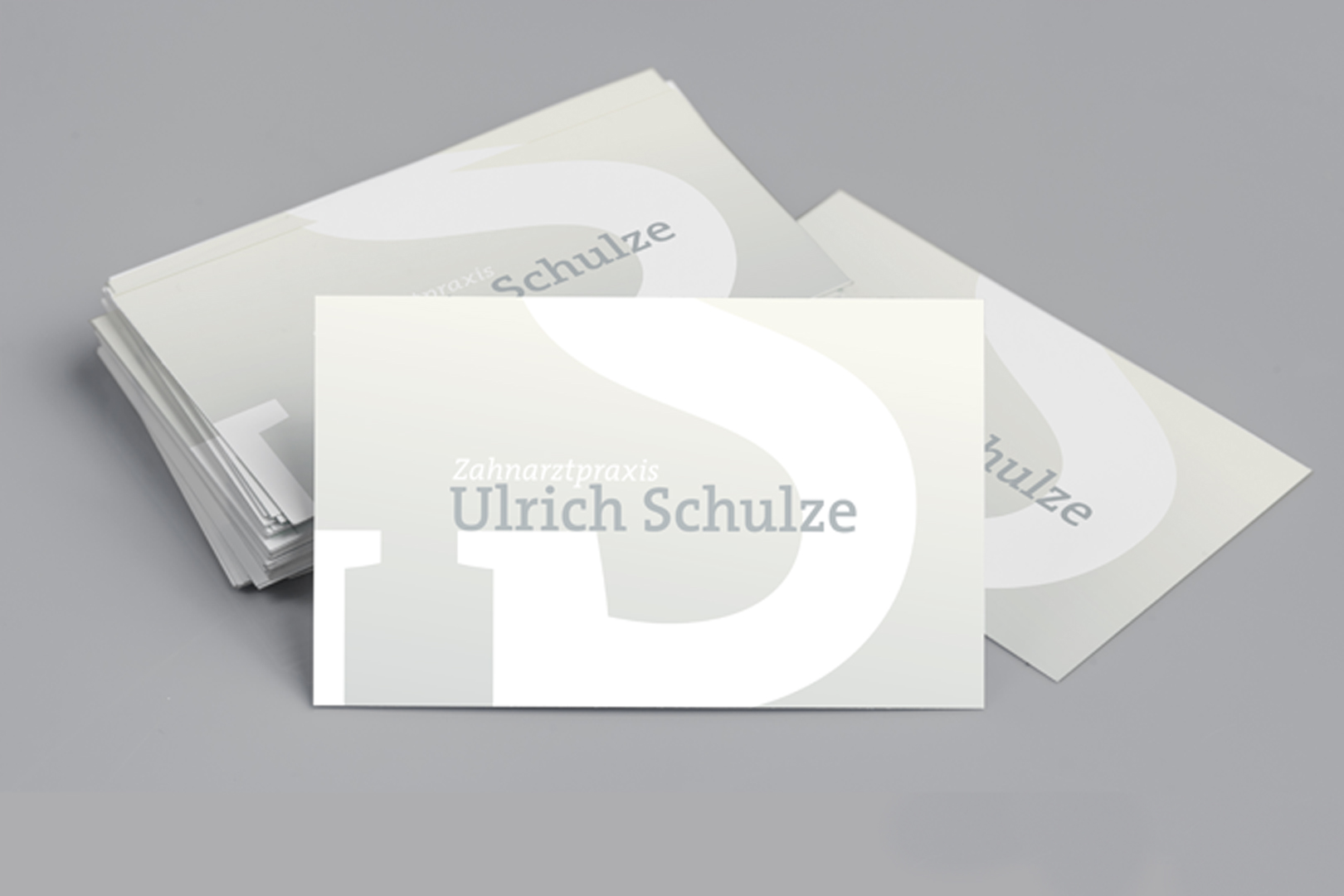
The goal in developing the visual language and logo for the dental practice was to convey the immediate image of dentistry, but without explicitly depicting teeth. We succeeded in that by using a combination of color blending, font positioning, and the motif of a white feather.

vertical signage for ulrich schulze dental practice, white color on beige background and white feather underneath

Gentle as a feather

Going to the dentist — this activity triggers anxiety in many people. Over his many years of professional experience, dentist Ulrich Schulze has developed the unique ability to apply anesthetics in such a way that the patient remains pain-free during treatments. It is a concern of the practice to make the visit to the dentist as gentle and pleasant as possible which is another reason why the feather symbol became the leitmotif for our corporate identity development.  

Check out our other projects:  

logo aquasenat on airport site

aquasenat GmbH

publicly appraised engineering experts


Showreel 2022

of our selected work

gif of imagery for rzm radiology clinic

RZM

Imagery for a radiology clinic

Creative solutions for your ideas, projects and company.

Get in touch. We Care.